When you plan to build a pole barn, color selection can be one of the most exciting but also challenging aspects. Color is not just for aesthetics, it can also affect the functionality of the building, its durability, and even your mood when you see it every day.
In this guide, we will take you through the most popular pole barn colors in 2025. Whether you want a rustic style that blends in with nature or a modern industrial design, there is inspiration for you here. We will also share some practical color selection tips to help you avoid common misunderstandings and easily find the color scheme that suits you best. Are you ready? Let’s explore the world of color in 2025 together!
Color application area: Your color palette is hidden in the architectural details
When choosing the color of a pole barn, many people only focus on the wall panels. In fact, the building is like a three-dimensional canvas, and the color of each area needs to be carefully arranged. The following is the color selection logic of the five key parts to help you avoid the trap of “color imbalance”.
Main color area of pole barn
- Wall panels: The wall panels are the most conspicuous part of the pole barn, and its color directly determines the overall style of the building. If you want the building to look modern and simple, you can choose neutral tones such as white and light gray; if you prefer a natural style, then earth tones such as olive green or sandy brown will be a good choice.
- หลังคา: The color of the roof not only affects the visual effect, but also may affect the temperature inside the building. Dark roofs (such as dark gray or black) help absorb heat in cold areas, while light roofs (such as white or light gray) can reflect sunlight and reduce indoor temperatures in hot areas.
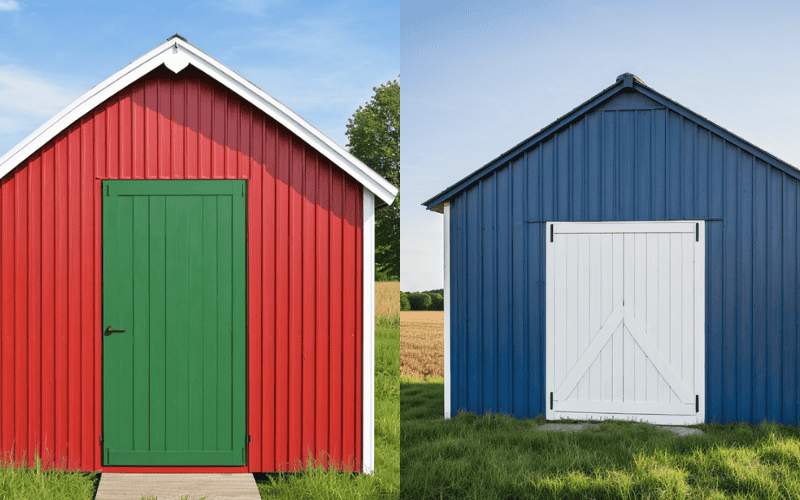
- Doors: The color of the door is the finishing touch of the pole barn design. You can choose a color that contrasts with the siding or roof, such as black doors with white siding, or dark brown doors with light gray roof, which can enhance the building’s layering and visual appeal.
- Trim & Fascia: Trims are key to highlighting the building’s outline. Usually, you can choose a color that contrasts with the siding or roof, such as white trim with dark siding, or black trim with light roof, which can make the building’s lines more clear and distinct.
- Wainscot: Wainscot not only protects the siding, but also adds a sense of detail to the building. Since this area is prone to stains, it is recommended to choose a dark color (such as dark gray or brown) to hide stains and keep in line with the overall design style.
💡 Expert Tip: After choosing the main color, make sure the colors of the roof, door, trim and wainscot are coordinated with each other for the best visual effect.
Pole barn color matching: Find your perfect style
Different color matching methods determine the overall visual effect of the Pole Barn. The following are 3 main color matching schemes:
1. Monochrome – unified color tone, simple and modern
Use a single color to cover the entire building to create a minimalist style.
Applicable to modern Pole Barn design, reduce visual impact, suitable for commercial use or residential style.
2. High-Contrast – Matching of light and dark to highlight the sense of hierarchy
Create a clear visual hierarchy through the contrast of light and dark to increase the three-dimensional sense of the building.
Common dark roof + light wall or light roof + dark wall combination, suitable for farms or commercial buildings.
3. Complementary Shades – Soft transition, harmonious and natural
Use similar colors to make the building color softer and avoid abrupt contrast, suitable for architectural styles that want to blend naturally into the environment.
Applicable to Pole Barns for rural, ranch or industrial use, especially for large-scale buildings.
Whether it’s a monochrome, contrasting, or gradient color scheme, the key is to find a combination that suits your personal style and functional needs. Below, we’ll dive into the color trends for 2025 to help you find the perfect color combination! 🎨
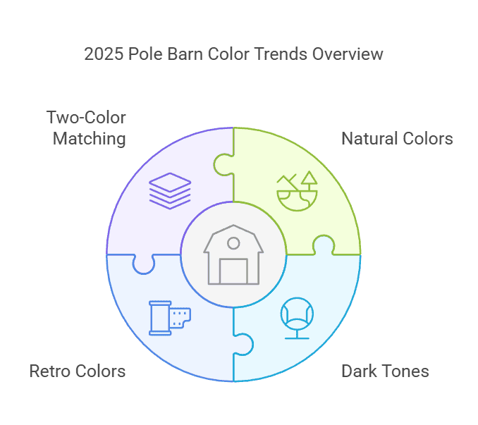
Pole Barn Color Trends 2025
- The rise of natural colors: warm neutral colors such as Beige, Burnished Slate, and Olive Green are in harmony with the natural environment.
- The popularity of dark tones: dark tones (such as Charcoal Gray, Matte Black, and Navy Blue) are still popular and suitable for modern and commercial styles.
- The return of retro colors: Barn Red and Hunter Green, which are classic farm styles, match rural style buildings.
- Two-color matching becomes the mainstream: wall panels contrast with roofs, doors, and decorative lines to create a sense of layering and personality.
The scientific logic behind the trend
- Dark-colored roofs can reduce the use of snow-melting agents by 30% in northern regions;
- Matt paint can make the building surface temperature 5-8℃ lower than glossy paint;
- The two-color scheme can increase the visual height of the building by 15% through line of sight.
Popular Pole Barn Colors in 2025: From Classic to Breakthrough
Whether you prefer simple monochrome or bold mix and match, this list will provide you with inspiration – data from the sales ranking of North American building materials suppliers and designer surveys in 2025.
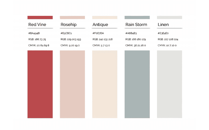
Top 10 popular monochrome recommendations
- Hazy Gray: Suitable for minimalist industrial style, matte texture hides scratches.
- Desert Sand: Warm neutral color, reduces the problem of sunlight reflection glare.
- Charcoal: The first choice for commercial buildings, with metal roofs for high-end.
- Barn Red: Retro soul color, more aging after fading.
- Matte Black: Modern, but needs to be cleaned regularly to avoid dirt.
- Olive Grove: Invisible cloak in forest environment, strong stain resistance.
- Weathered Iron: Industrial style weapon, perfect match with galvanized steel doors.
- Nautical Navy: solemn and energetic, suitable for coastal areas to resist salt spray.
- Caramel Brown: wood texture friendly color, creating a warm barn feeling.
- Pearl White: reflective rate up to 85%, a cooling artifact in hot areas.
Mix and match recommendation (10 golden formulas)
✔ Contrast color scheme
- Black + white: matte black roof + pearl white wall panel, timeless classic.
- Dark blue + light gray: navy blue wall panel + haze gray decorative line, modern and modern.
- Caramel Brown + Sage Green: brown wall and green door, standard American pastoral style.
- Rust Red + Charcoal Gray: red roof and gray wall panel, industrial style hardcore CP.
- Farm Red + Hunting Green: red wall and green roof, retro farm narrative sense.
✔ Gradient color scheme
- Sand color → caramel brown: wall panel gradually changes from top to bottom, visually raising the building.
- Haze Gray → Pearl White: The transition from light gray on the roof to white on the wallboard creates a light and suspended feeling.
- Olive Green → Moss Green: A natural gradient that blends in with the woodland environment.
- Dark Gray → Light Silver Gray: A full metal facade with a futuristic technology style.
- Terracotta Orange → Light Apricot: A warm gradient that is suitable for sunset landscape areas.
Find Inspiration: Where to Get Barn Color Ideas
When choosing colors for your pole barn, inspiration can come from all over life.
Nature – Pull colors from the landscape, plants, sunsets, and create a look that harmonizes with nature.
Architecture and Design – Look to modern farmhouse, industrial, or rustic styles for inspiration on classic color schemes.
Online Resources – Browse platforms like Pinterest and Houzz to explore the latest trends and real-world examples.
Pitfalls: These colors can ruin your pole barn aesthetic
Choosing the wrong color can not only affect the appearance of the building, but also cause functional defects. Here are the “7 types of high-risk colors” we have summarized to help you avoid common pitfalls.
1. Too bright colors: a short-lived visual disaster
Typical representatives: bright orange, fluorescent yellow, electric purple
Fatal injury: fades three times faster than neutral colors under ultraviolet light, and may turn into a turbid “dirty pink” after a year. Worse, these colors will reduce the property’s valuation by 5%-8% – potential buyers often worry that the cost of recoloring is too high.
Alternative: If you want a vibrant color, choose a softer, more classic hue, such as Barn Red or Hunter Green, which will not only stay timeless but also enhance visual appeal.
2. Dark trap in hot areas: solar heat absorber
Dangerous combination: all black siding + dark blue roof (surface temperature can reach 70℃ in summer)
สารละลาย: Use the combination of “dark roof + light siding”, such as graphite gray roof with sandstone white wall, which can not only maintain the dark texture, but also reduce the indoor temperature by 4-6℃.
3. Maintenance nightmare of extremely light colors
Counterexample: Pure white siding in a pasture environment, dust stains are clearly visible after 3 months, and high-pressure cleaning is required at least twice a year.
Improvement plan: Choose buttercream or pearl white with warm tones, which are 40% more resistant to dirt than pure white.
4. Inharmonious contrasting color combination: aesthetic car accident scene
Disaster case: The combination of purple siding + orange-red roof will make the building look like a “giant candy wrapper” and may even violate the community’s building color specifications.
Safety rule: The contrasting colors should be matched within 90 degrees of the color wheel. For example, blue-gray + burnt orange (60 degrees of contrast on the color wheel) is more harmonious than purple + orange (180 degrees of opposition).
5. The invisible cost of highly reflective colors
The reflection intensity of the mirrored silver roof under the midday sun can reach 3500 candela/square meter, which not only exacerbates the heat island effect, but may also cause complaints due to glare interference to neighbors.
It is recommended to choose matte metal coating with a reflectivity of less than 30%.
6. Outdated colors
Age minefield: Azure Blue and Hot Pink, which were popular in the 1990s
Data warning: Buildings using outdated colors have an average browsing time reduction of 37% on real estate trading platforms, and buyers subconsciously believe that “the overall building is aging.”
7. The dilemma of repairing non-standard customized colors
Although non-standard customized colors are unique, color difference problems are prone to occur during later repairs, especially when the wall or roof needs partial repair.
To ensure color consistency and easy maintenance, we recommend using the RAL standard color cards we provide. These colors have been rigorously tested, can be accurately mixed at 90% of paint manufacturers around the world, and will not be discontinued within 50 years.
Emergency remedy
If you accidentally choose the wrong color, you can use these tips to save it:
- Dark colors absorb too much heat: add roof sunshade grilles or climbing plant green walls
- Light colors are easy to get dirty: spray self-cleaning paint containing nano titanium dioxide
- Contrasting colors overturn: use neutral decorative lines (such as light gray) to buffer color conflicts
Six Key Factors to Consider When Choosing Pole Barn Colors
When choosing colors for your pole barn, there are some scientific factors to consider in addition to aesthetics to ensure that the color is both practical and economical. Here are 6 key considerations:
1. Thermal Performance: Dark Roof vs. Light Walls
Color plays a major role in heat absorption and energy efficiency. Darker colors absorb more heat, which can increase indoor temperatures, while lighter colors reflect heat, helping to keep buildings cooler. This is especially important in hot vs. cold climates.
Measured Surface Temperatures of Different Colors (at 90°F / 32°C Outdoor Temperature)
| สี | Surface Temperature (°F) | Surface Temperature (°C) |
| Black (Matte Black) | 175°F | 79°C |
| Dark Blue | 165°F | 74°C |
| Charcoal Gray | 160°F | 71°C |
| Barn Red | 150°F | 65°C |
| Beige | 135°F | 57°C |
| Pure White | 120°F | 49°C |
2. Local Regulations: HOA & Community Color Restrictions
Many Homeowners Associations (HOA) and local governments have strict color regulations, especially for buildings in residential or commercial zones. Some HOA rules prohibit black or overly bright colors, while agricultural zones may require earth tones (e.g., green or brown) to blend with the landscape.
Always verify HOA or zoning regulations before finalizing your color choice to avoid costly repainting.
3. Surrounding Buildings: Using Adobe Color to Find the Best Match
Your pole barn is part of a larger visual landscape, whether it’s surrounded by other buildings, farmland, or trees. Choosing colors that complement the surroundings will make your pole barn look harmonious rather than out of place.
To make your pole barn blend in with its surroundings, use a tool such as Adobe Color to analyze the color palette of neighboring buildings and choose colors that coordinate with them. This will not only enhance the overall aesthetic, but also avoid a design that’s too obtrusive.
4. Functional Needs: Best Colors for Different Uses
Not all pole barns serve the same purpose. The function of the building should influence the color choice to enhance practicality and reduce maintenance.
Our Recommended Colors for Different Pole Barn Applications
Different pole barns serve different purposes, and color choices should reflect both functionality and aesthetic appeal. Here are our expert recommendations based on usage:
🏡 Farm & Agricultural Buildings
- Classic Barn Red + White → Ideal for traditional farm aesthetics.
- Hunter Green + Beige → A natural, earthy look that blends with rural landscapes.
🏢 Commercial & Industrial Buildings
- Matte Black + Charcoal Gray → A modern and sleek appearance suitable for warehouses and business structures.
- Navy Blue + Beige → A sophisticated yet professional look for commercial storage buildings.
🏠 Residential & Multi-Purpose Barns
- Sand Beige + Deep Brown → A warm and inviting option for home-adjacent structures.
- Smoke Gray + Silver Metallic → A subtle yet elegant choice for contemporary residences.
5. Maintenance Cycle: Dark Colors Need Repainting Every 5 Years, Neutral Colors Every 8 Years
การ longevity of paint depends on its color. Darker colors fade faster and show scratches more easily, requiring more frequent repainting, while neutral and lighter tones tend to last longer.
Repainting Cycle for Different Colors
| Color Type | Repainting Frequency |
| Black, Dark Blue, Charcoal Gray | Every 5 years |
| Barn Red, Hunter Green | Every 6-7 years |
| Beige, Smoke Gray, Burnished Slate | Every 8 years |
💡 คำแนะนำ: If you want low-maintenance colors, go for neutral shades like Beige, Smoke Gray, or Burnished Slate. Also, opt for high-durability coatings (e.g., 25-year warranty polyester powder coating) to extend lifespan.
6. Cost Control: Single-Color Construction is 25% Cheaper than Multi-Color Designs
Budget is another major factor in choosing colors. A single-color paint scheme is usually 25% cheaper than a mixed-color scheme because:
- Single-tone application requires only one type of paint, reducing material costs.
- Two-tone or gradient designs จำเป็นต้อง additional labor and materials, increasing expenses.
Cost Comparison by Color Scheme
| รูปแบบสี | Estimated Cost Increase |
| Single-Color (e.g., all-black, all-gray) | Base Cost |
| High-Contrast (e.g., Black + White, Red + White) | +15% |
| Gradient Shades (e.g., Dark Gray + Light Gray, Olive Green + Beige) | +25% |
Five Quick Color Matching Tips from Professional Designers
1️⃣ 70% Rule – Use your main color on 70% of the barn to keep it visually balanced.
2️⃣ Sample Testing – Get a free A2-size color sample (more accurate than screen colors).
3️⃣ Lighting Effect – Check how colors change in morning, afternoon, and evening light.
4️⃣ Ask an Expert – Our color consultants help you find the best match for function & style.
5️⃣ Easy Rule to Remember - “Dark roof, neutral walls, standout doors” for a timeless look!
Our color solutions
We provide comprehensive color selection and technical support for your โรงนาเสา to ensure that your building is both beautiful and durable. Here are our color solutions:
1. Full color library
Standard colors: We offer 48 RAL classic colors, covering a variety of options from natural neutrals to modern dark colors. These colors have been tested for weather resistance and long-term performance in various climates.
Custom colors: If you have special needs, we support Pantone/PMS color number conversion and provide customized finishes, including matte, gloss and texture coatings, to ensure that your customized needs are met.
2. Advanced Coating Technology: Superior Paint Protection
Our premium coatings go beyond just color—they are designed to withstand the elements and maintain their beauty for years to come. We use a four-layer protection system that ensures long-lasting durability and minimal maintenance.
✅ Four Layers of Protection:
| คุณสมบัติ | Our Coatings | Standard Industry Coatings |
| ความต้านทานรังสียูวี | Anti-fade UV-blocking technology | Limited UV protection |
| Salt & Corrosion Resistance | Salt fog-resistant coating | Basic weatherproofing |
| Self-Cleaning Properties | Dirt-repelling nano-coating | No self-cleaning capability |
| ความคุ้มครองการรับประกัน | 25-Year Warranty | Typically 5–7 years |
Need help choosing the right color? Contact our team for expert guidance and color samples to visualize your pole barn before making a final decision!
คำถามที่พบบ่อย
Can I order a color sample before deciding?
Yes! We provide free A2-size physical samples so you can see the color accurately in different lighting conditions.
Which colors resist fading the best?
Our advanced coatings with UV protection ensure colors stay vibrant longer compared to standard finishes.
Best fade-resistant colors:
✅ Burnished Slate – Resistant to sun exposure and weathering
✅ Charcoal Gray – Holds its depth longer than lighter grays
✅ Barn Red – Classic red with strong UV-resistant pigments
✅ Hunter Green – Maintains richness, especially in shaded areas
✅ Beige & Clay – Neutral tones that show minimal fading over time
Is it easy to produce color differences when customizing Pantone colors?
No. We use industrial-grade spectrophotometers to ensure that the Pantone color conversion error ΔE<1.5 (undiscernible by the naked eye). Custom orders are all accompanied by sample color plates for later color comparison.